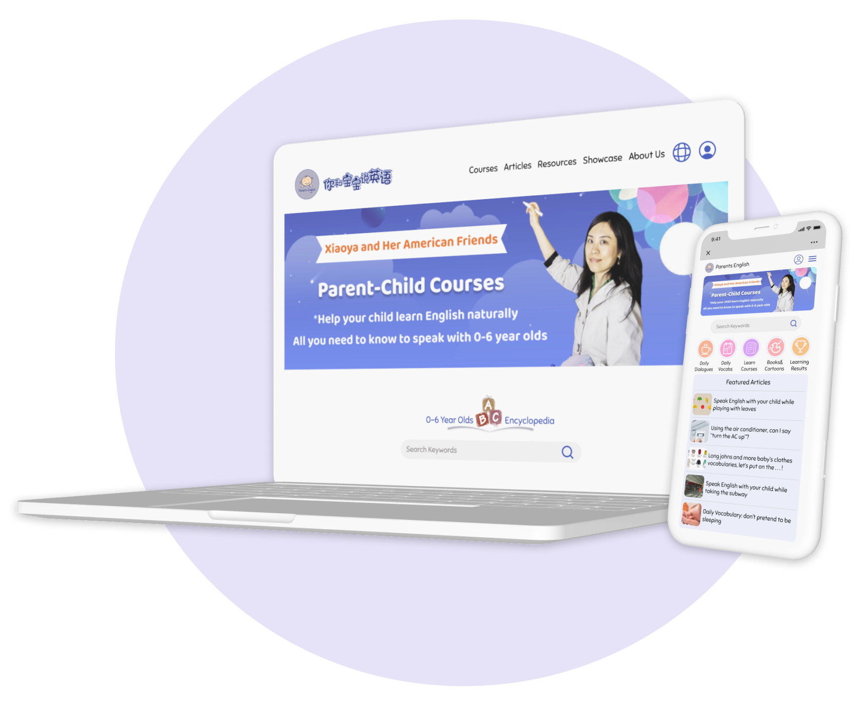
Parents English
Redesign mobile website and desktop landing page to allow users to navigate the services more efficiently.
Visit Parents English website at: www.parentsenglish.com
Re-imagining bilingual family education
Redesign Website:
Duration
80 hours within 4 weeks
Role
UI/UX Designer and Researcher
Before diving into the flow…
Parents English is an edtech startup company based in China. Founded by a Chinese mom with the experience of studying and working abroad, Parents English is dedicated to help Chinese parents with 0-6 year olds to create a bilingual environment at home and help their child learn English and Chinese at the same time.
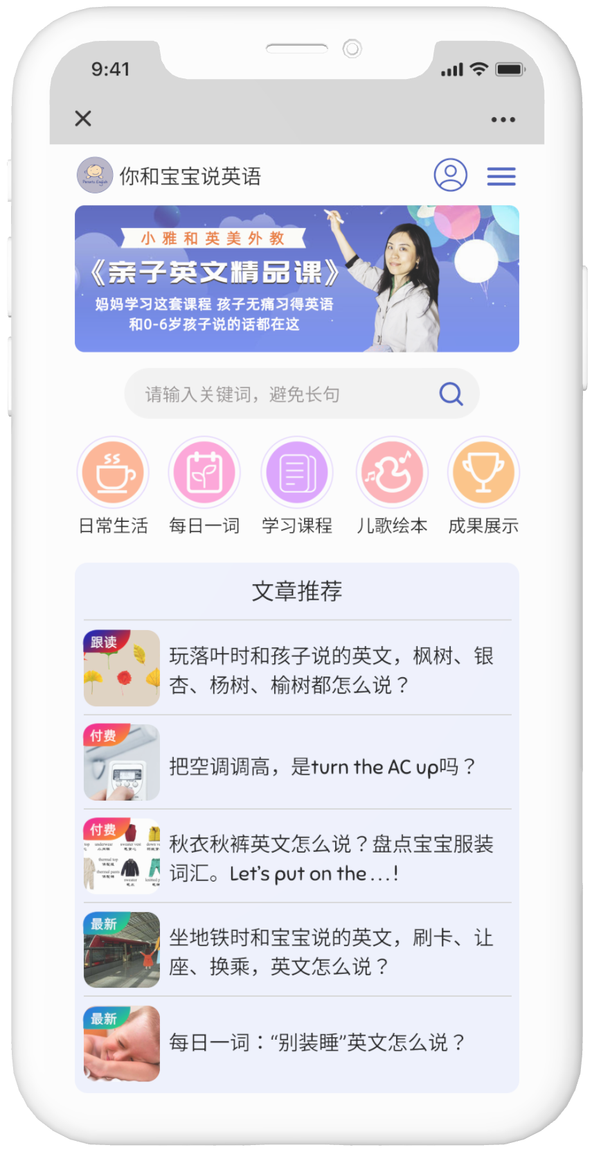
This project is a redesign of the mobile and desktop website to help users navigate the website and locate different services more smoothly. Since most of the company’s services are hosted on Wechat, this project focuses on the redesign of the mobile interface. A desktop homepage is designed to be responsive with the mobile interface.
Process:
User research, End-to-end UI/UX Design, Wireframing, Prototyping, Usability Testing, Iteration
Tools:
Figma, Adobe Illustrator, Google Docs, Google Sheets, WeChat, Zoom
Feature Preview
Introducing Parents English
A comprehensive family bilingual education guide for you and your child. Creating an authentic bilingual environment for your child through precious bonding time.
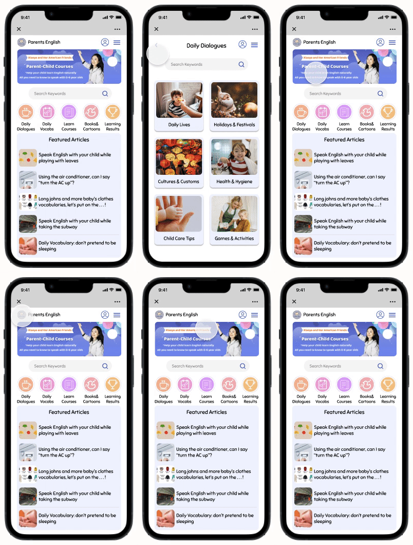
Simple and clear panel for easy access to all your resources
All the features organized in WeChat based mobile website. Navigating services made easy for long term and new users.
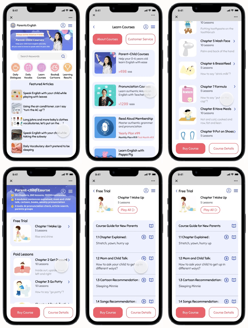
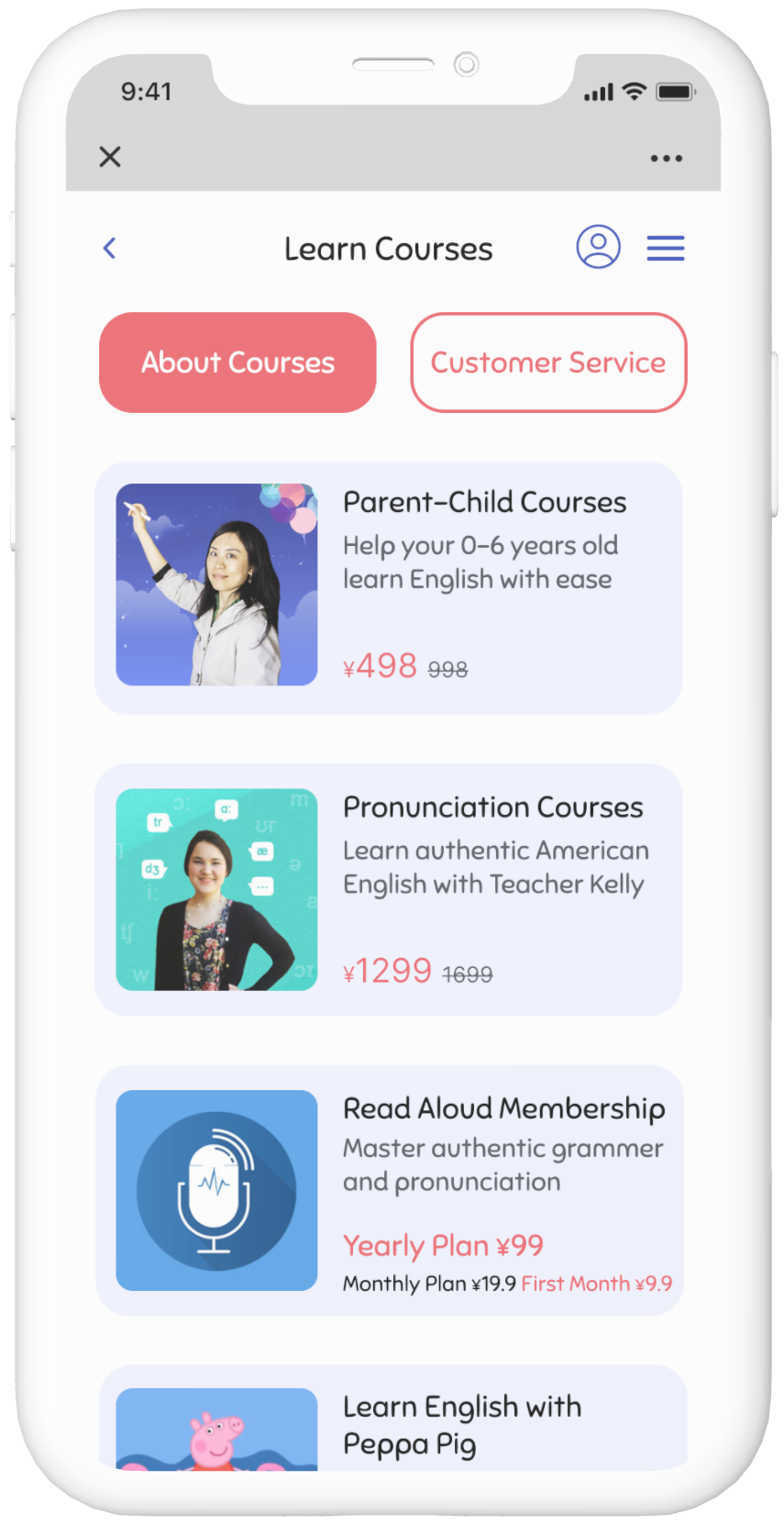
Quickly find the best courses for your family’s need
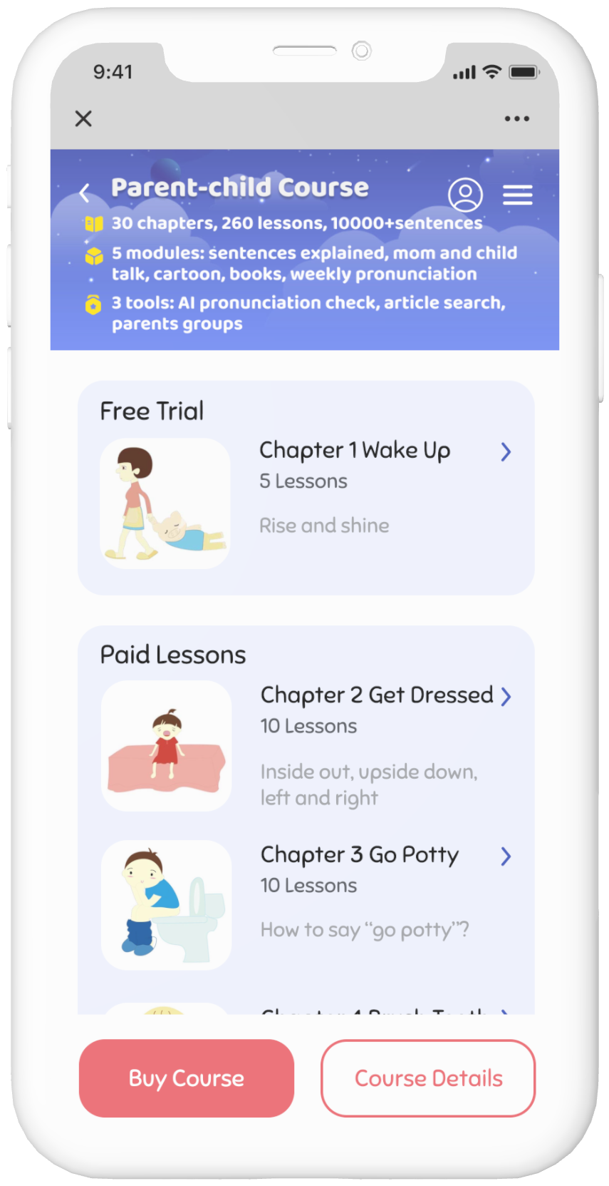
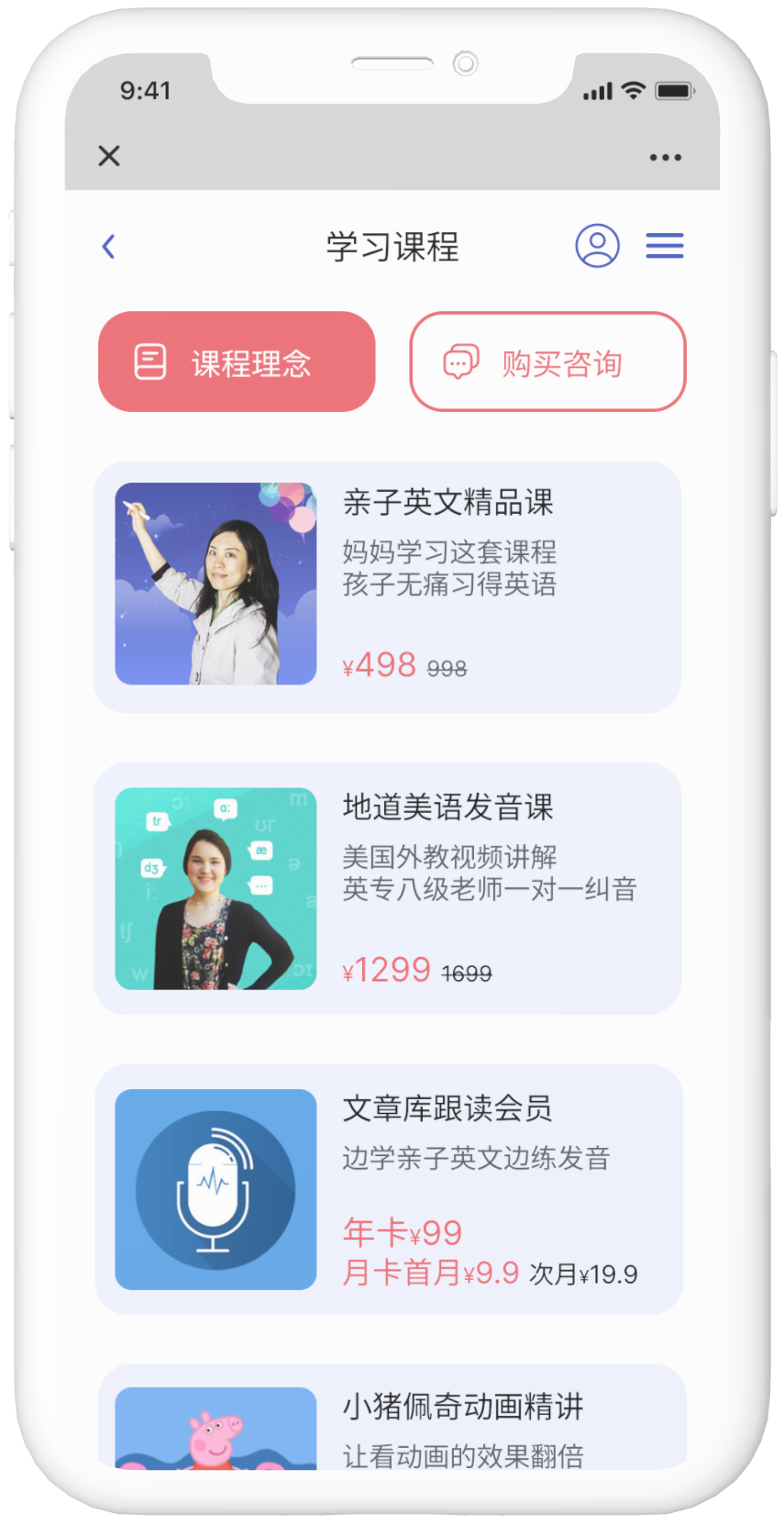
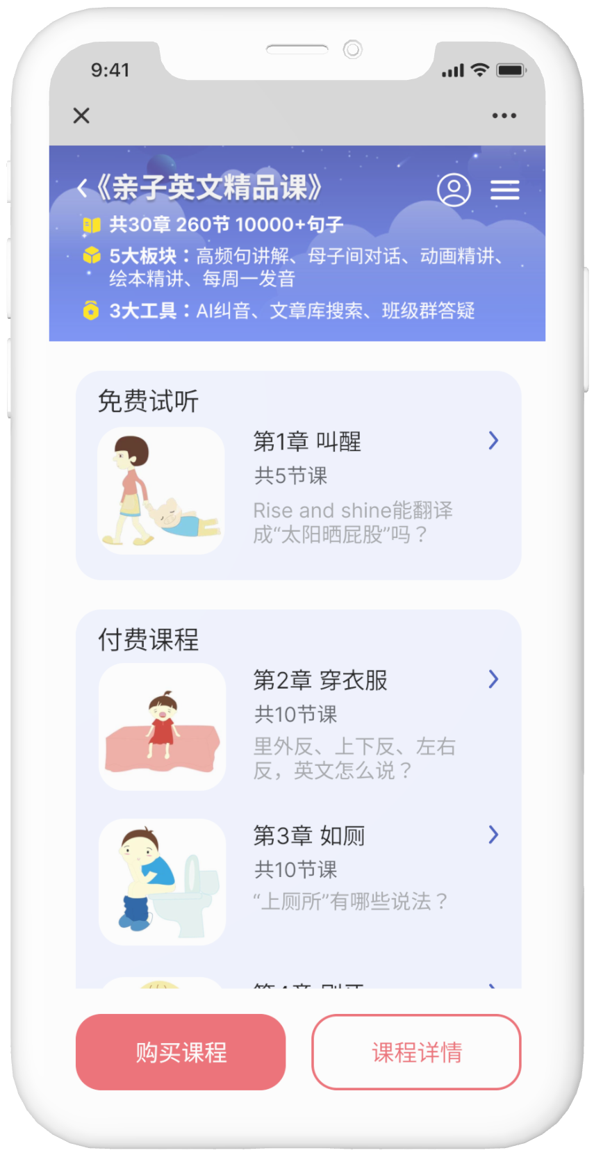
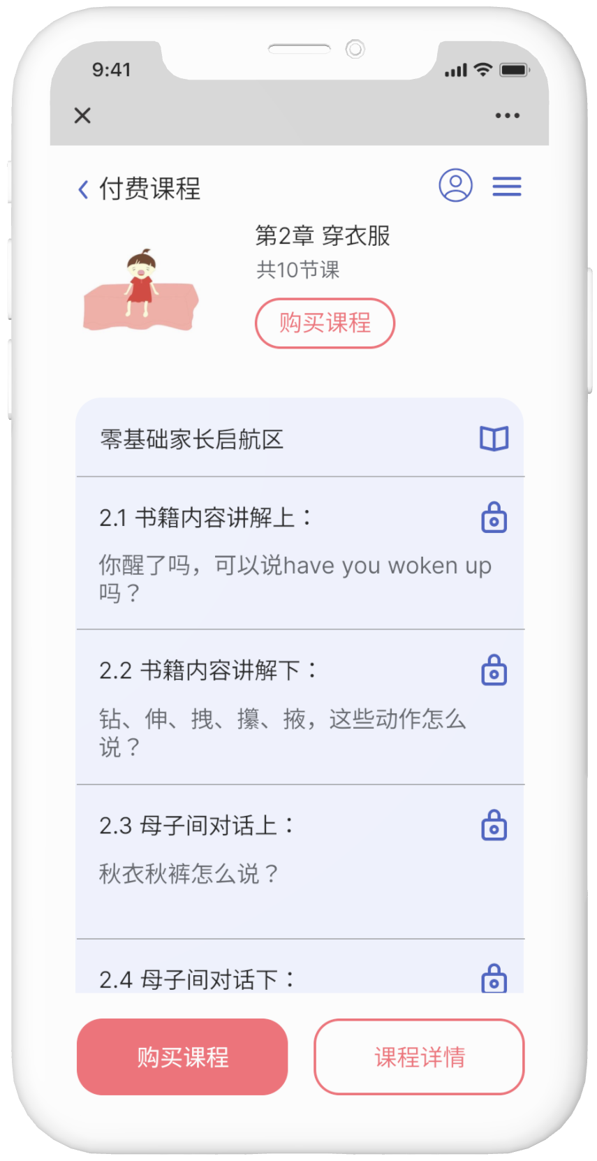
Easy access to all the courses. Simply take a free trial lesson and subscribe to your favorite course with ease.
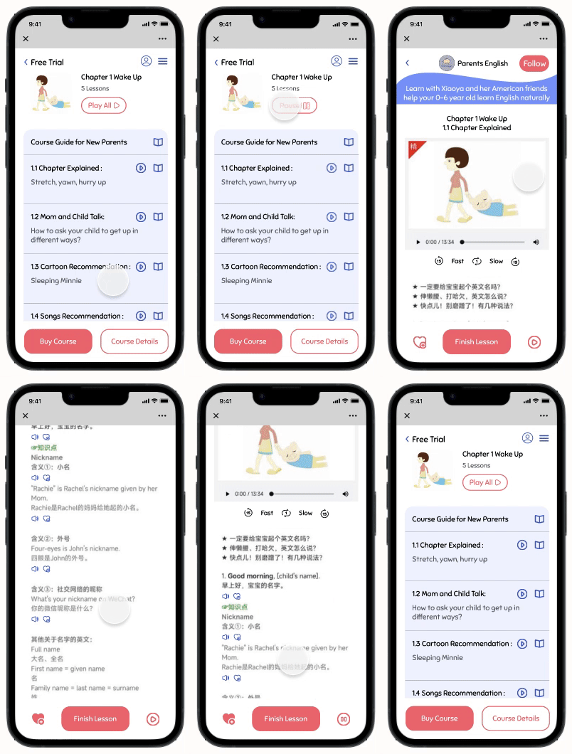
Save your favorite lesson and listen to it on the go
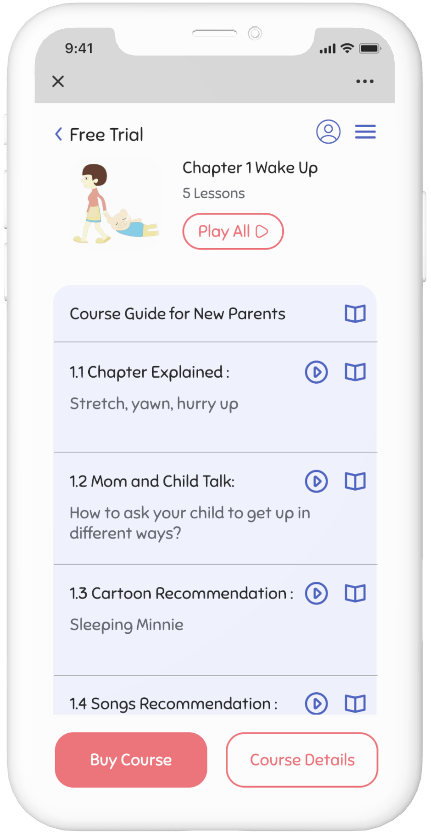
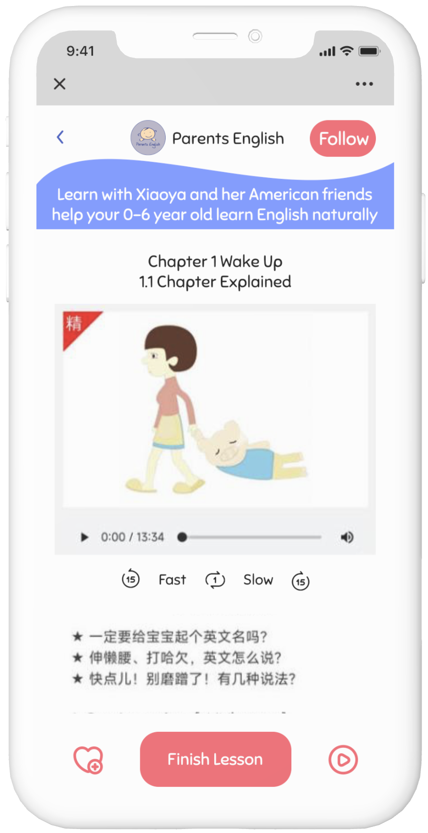
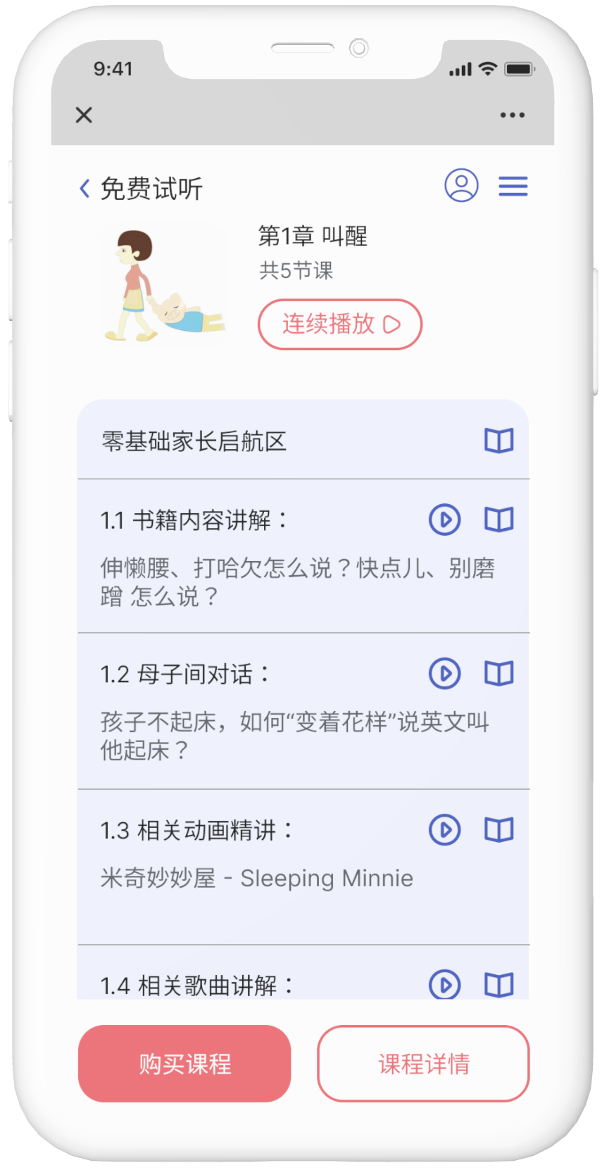
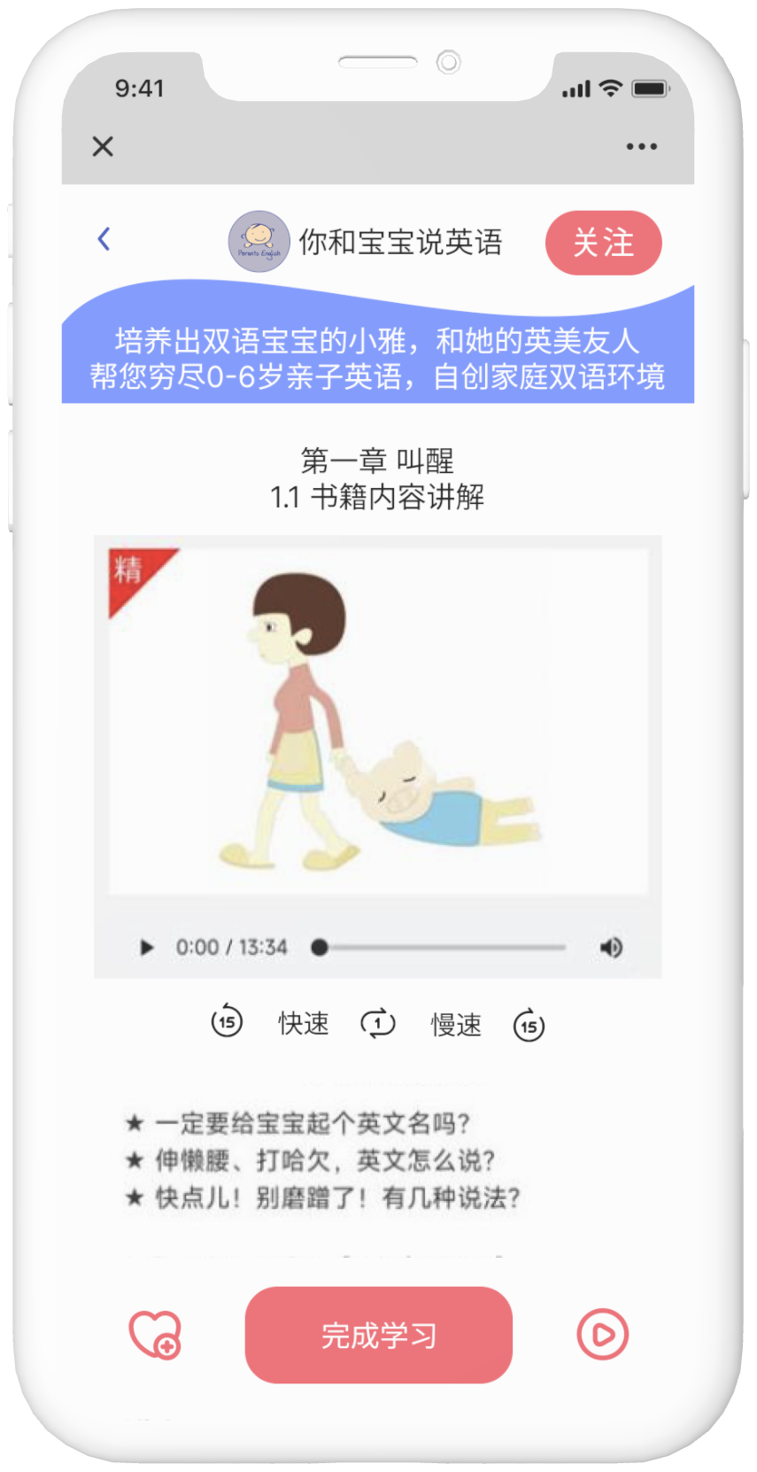
Upgraded lesson detail page. Listen to audio for individual sentences or auto-play the whole lesson. Jump back in your favorite lesson any time.
Research
Meeting with Client
To kick start this project I had a meeting with my client to discuss her main goals and needs for this project. Over the years, the company has launched many new features. Although most of their services are hosted on Wechat, there are different portals to access different services, including the Wechat official account, mobile website, and mini programs, which makes navigation complicated and confusing. The main purpose of this redesign is to make the mobile website a centralized portal to organize all the main services and make it more intuitive and convenient to locate and access different services.
Research Goals
In order to improve the overall user experience, it is important to learn the competitor websites’ features and the users’ needs. Learning about competitors will help me understand the strengths and weaknesses of Parents English platform compared with other businesses. Understanding the users will help me paint a clearer picture of what features I should include to provide a seamless experience.
Understanding the Competitors
To understand the competitors, I selected 4 companies in the early language education field to conduct competitive analysis. I examined both the UI designs and user experiences of these companies. Although most of their services are based on their Apps instead of website, this analysis gave me inspirations on both the UI and UX of my mobile website design.
Understanding the Users
I sent out surveys to Parents English users to learn about their learning habits and current experience using Parents English platform to find out how I can improve their learning experience and cater to their needs.
Topics covered in the survey questions include:
Users Bio
Users’ child Bio
Learning habits and daily routine
Current experience using Parents English platform
Suggestions for improvements
Key Research Insights
39 responses were collected from the users. The key research insights are as follow:
Quantitative Research Insights:
Over 90% of users are female
Over 90% of users are between 25-44 years old
Over 80% of users’ kids are between 1-5 years old
Over 97% of users view content on their phone
Users find the most useful services are articles, daily vocabularies, and parent-child English lessons
More than 70% of users spend less than 30 minutes per day viewing contents on Parents English
Qualitative Research Insights for Potential Improvements
I included an open-ended question at the end of the survey asking the users what features or improvement they wish to have. Here are the top answers:
Easier access to the lessons
Better categories of articles
Auto-play between different lessons
Define
User Persona
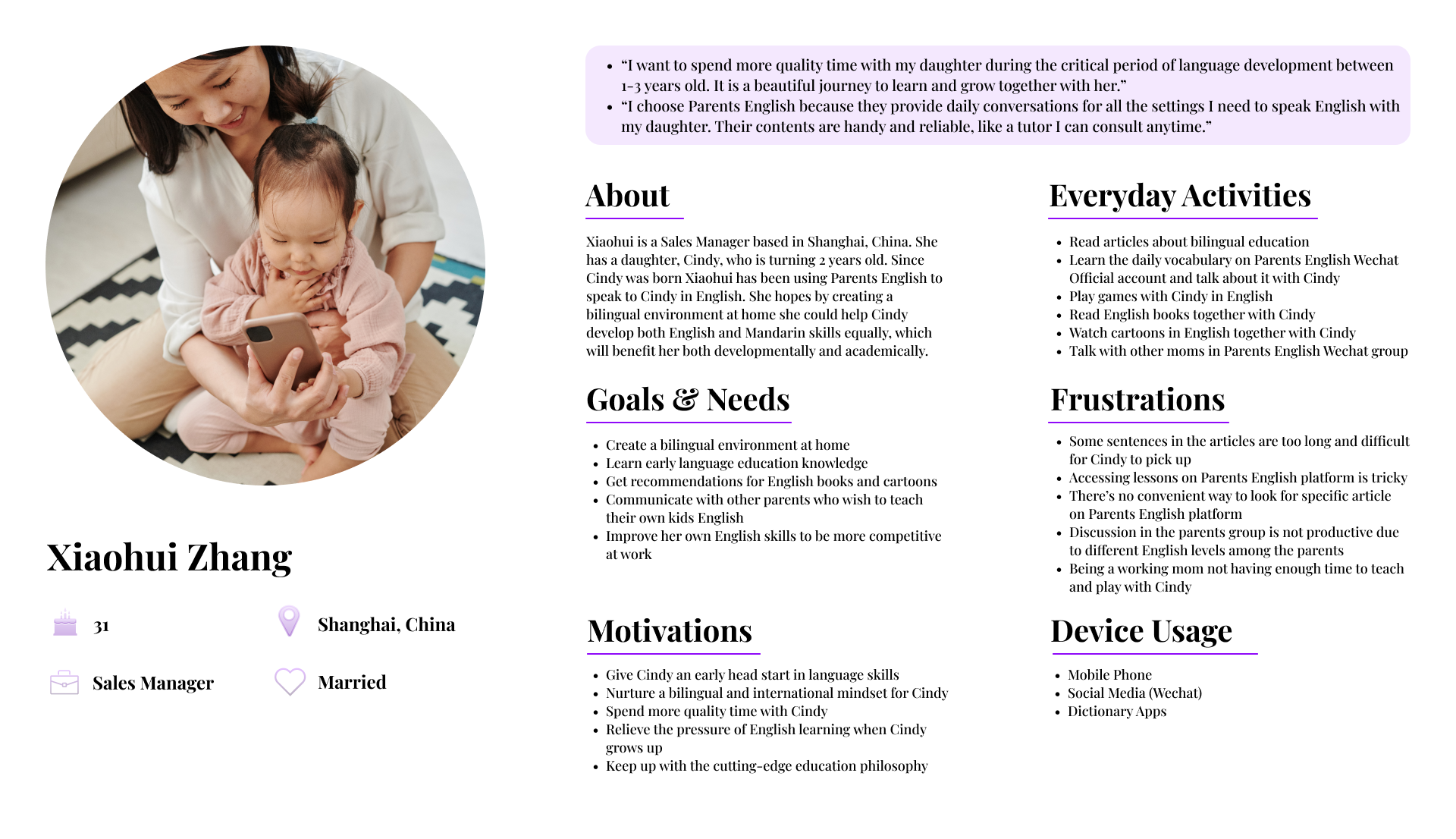
As I analyze my research data, a clear image of the primary user persona emerged from the survey results:
Meet Xiaohui, a 31 years old mom with a 2 years old daughter based in Shanghai, China. She has been using Parents English to learn childcare knowledge and help her daughter develop English skills.
Ideate
Sitemap
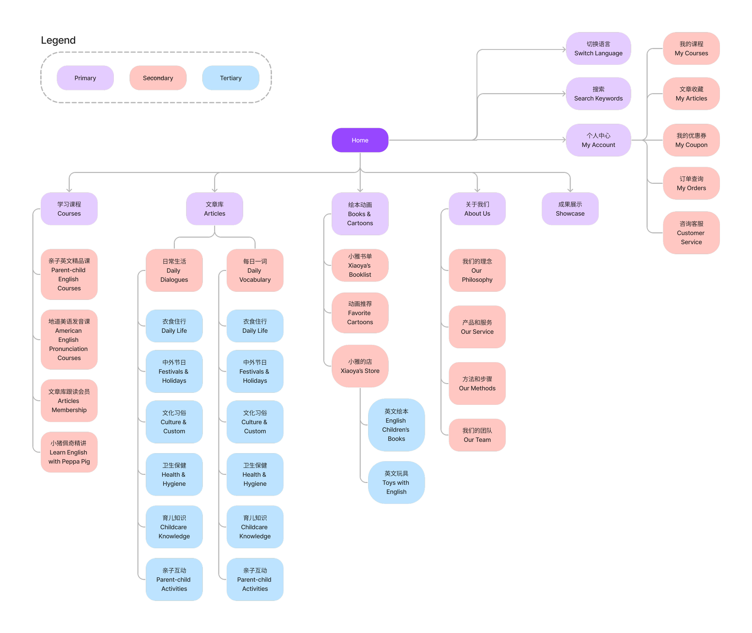
With the users and my client’s needs defined, I started the ideation process by designing the sitemap for the desktop and mobile website. There are some slight differences in the website structure for desktop and mobile because of the different purposes and functions of the two interfaces. The user research result shows that more than 97% of users view contents on their phone. Therefore, the mobile website design emphasizes on optimizing the learning experiences, including reading articles and taking courses. Whereas the desktop website emphasizes on marketing purposes, where About Us was included in the main navigation which demonstrated the philosophy and services of the company.
Desktop Sitemap
Mobile Sitemap
User Flow
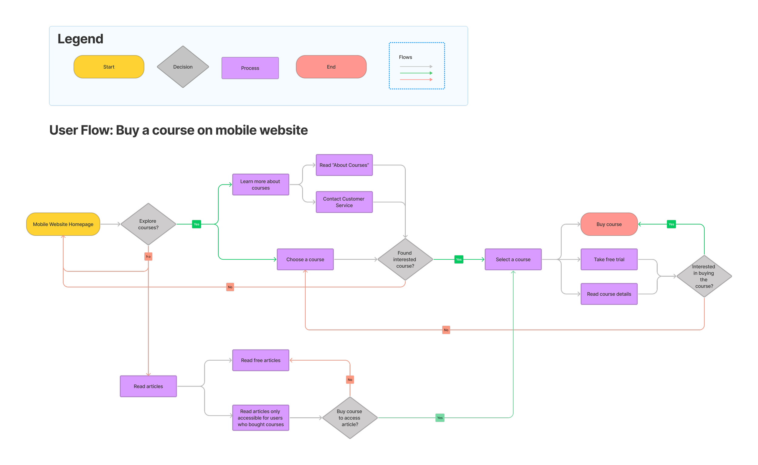
After discussing with my client, we decided to focus on optimizing the process of taking courses on mobile website. To find all the paths users can take to buy and learn a course and all the screens needed to complete the task, I created a user flow for buying a course based on the mobile sitemap. In this user flow, users can access the courses through either the navigation of Learning Courses or Read Articles.
Design
Mid-Fi Wireframes
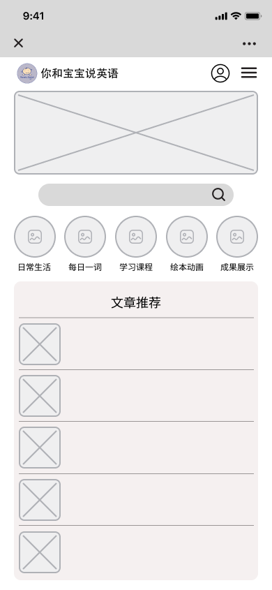
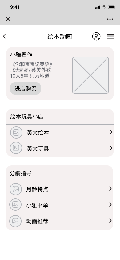
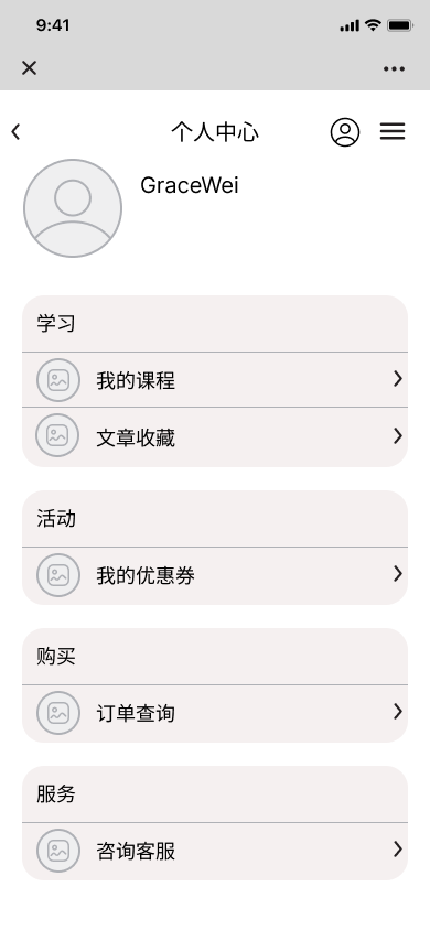
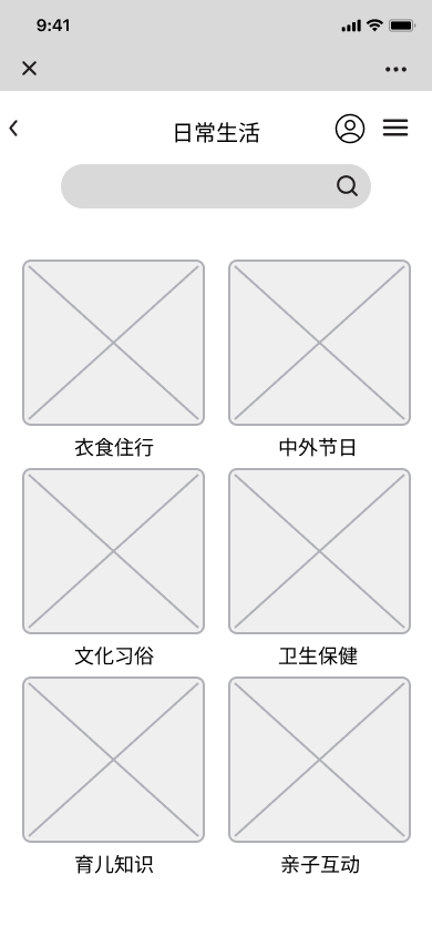
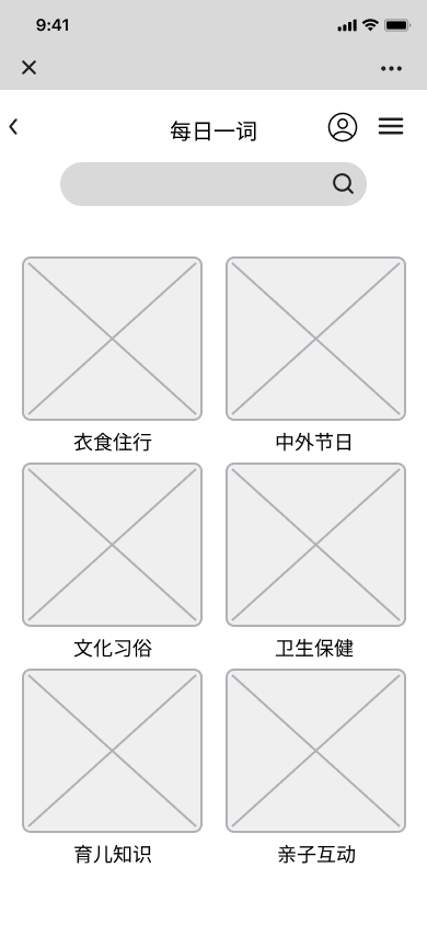
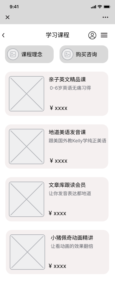
I skipped the low-fi wireframes and started with mid-fi in this project because it’s more presentable and easier for my client to understand my design. I designed the responsive homepage for both mobile and desktop. Since the redesign focuses on the learning experience on the mobile website, I also created pages in the navigation and the whole task flow for “Learn Courses” for the mobile website. The mid-fi prototype was created in Chinese for the convenience of communication with my client.
UI Component library
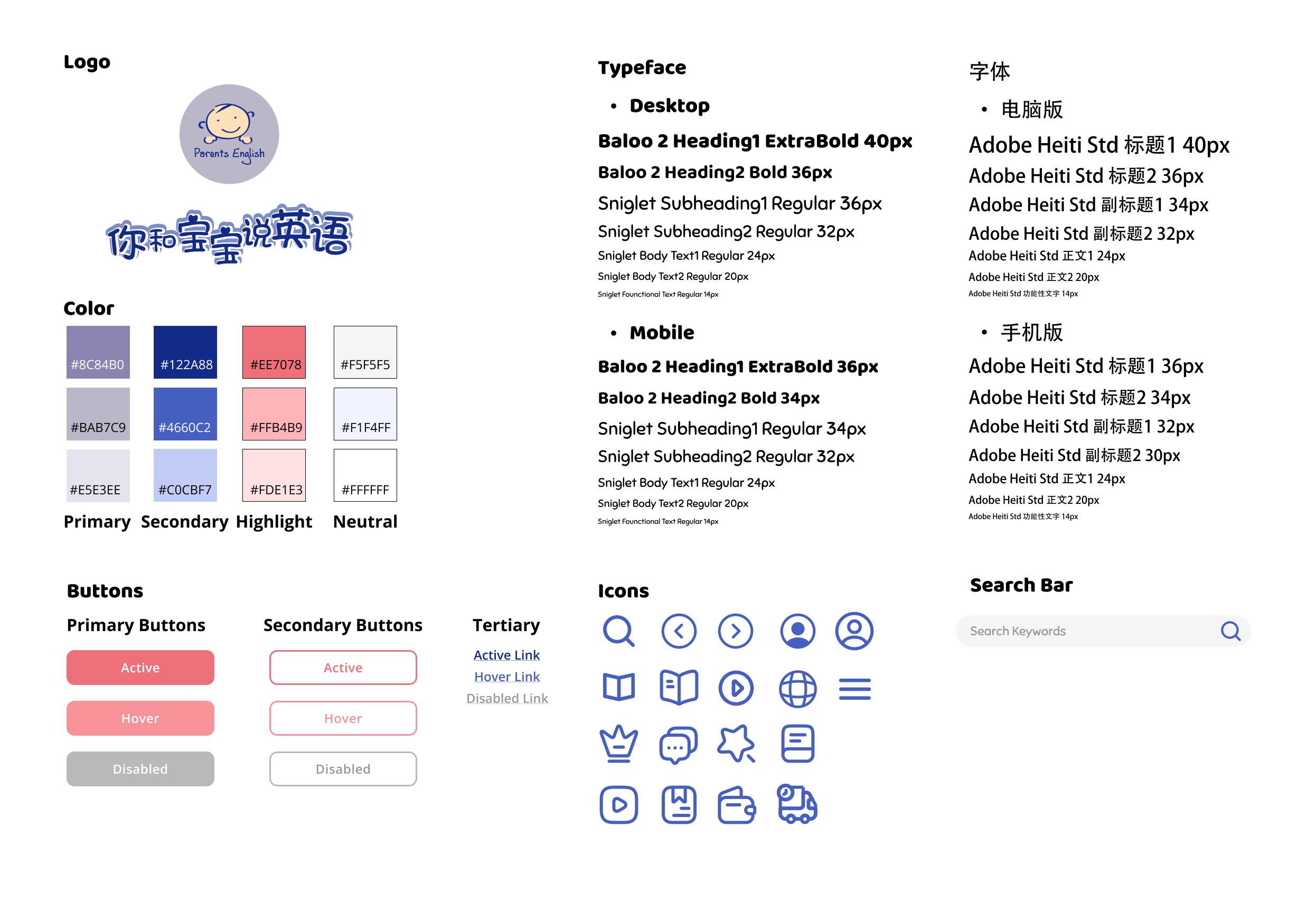
My idea for the UI design was based on the style of the logo provided by my client. I used the purple and blue color from the logo as the primary color in my color palette for consistency of branding. I chose a bright rose color as a highlight to create a warm and welcoming look, and make the CTA buttons more eye-catching. I used a light blue color for the background to compliment the primary color. Since the website is pretty content heavy with lots of reading materials, the light blue background also calms the eyes and mind which helps users focus on their learning.
High-Fi Wireframes and Prototype
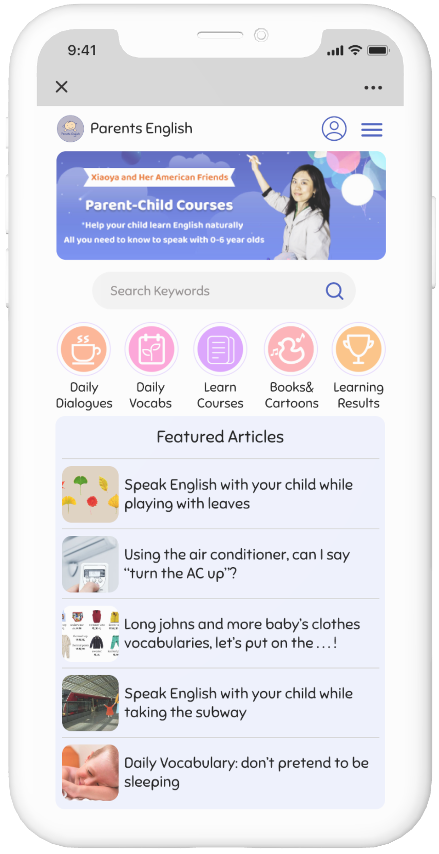
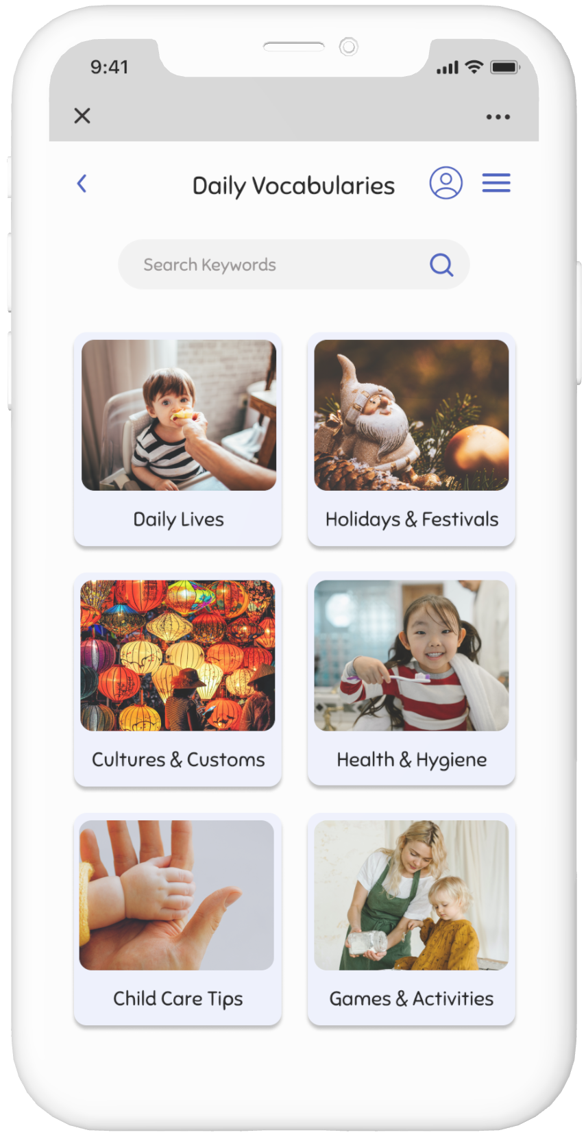
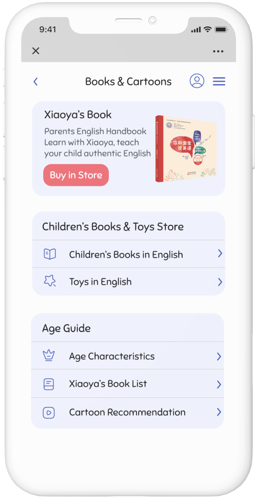
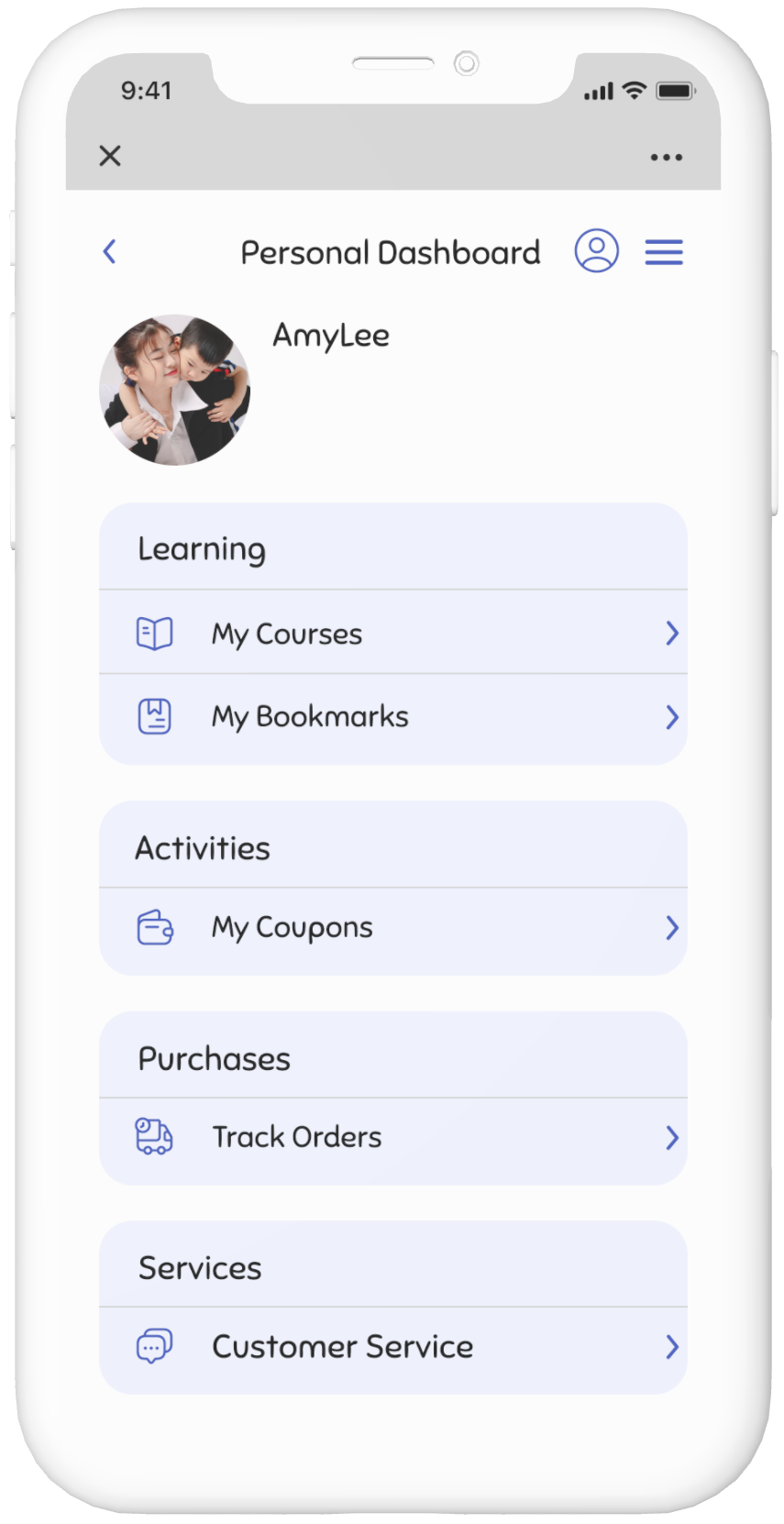
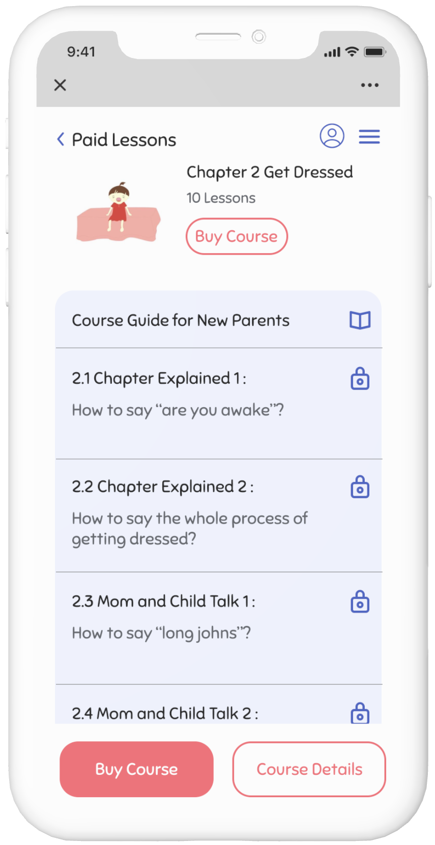
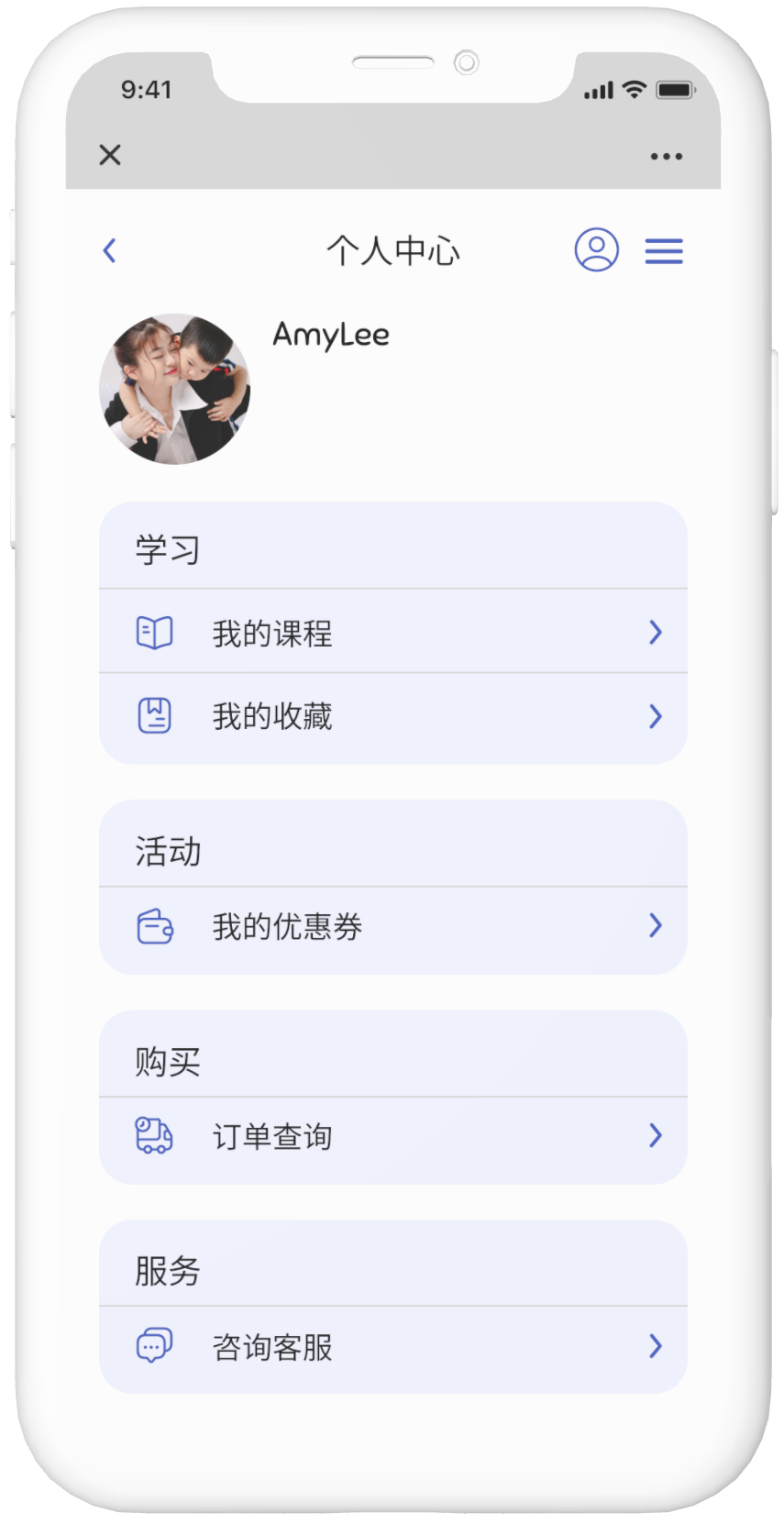
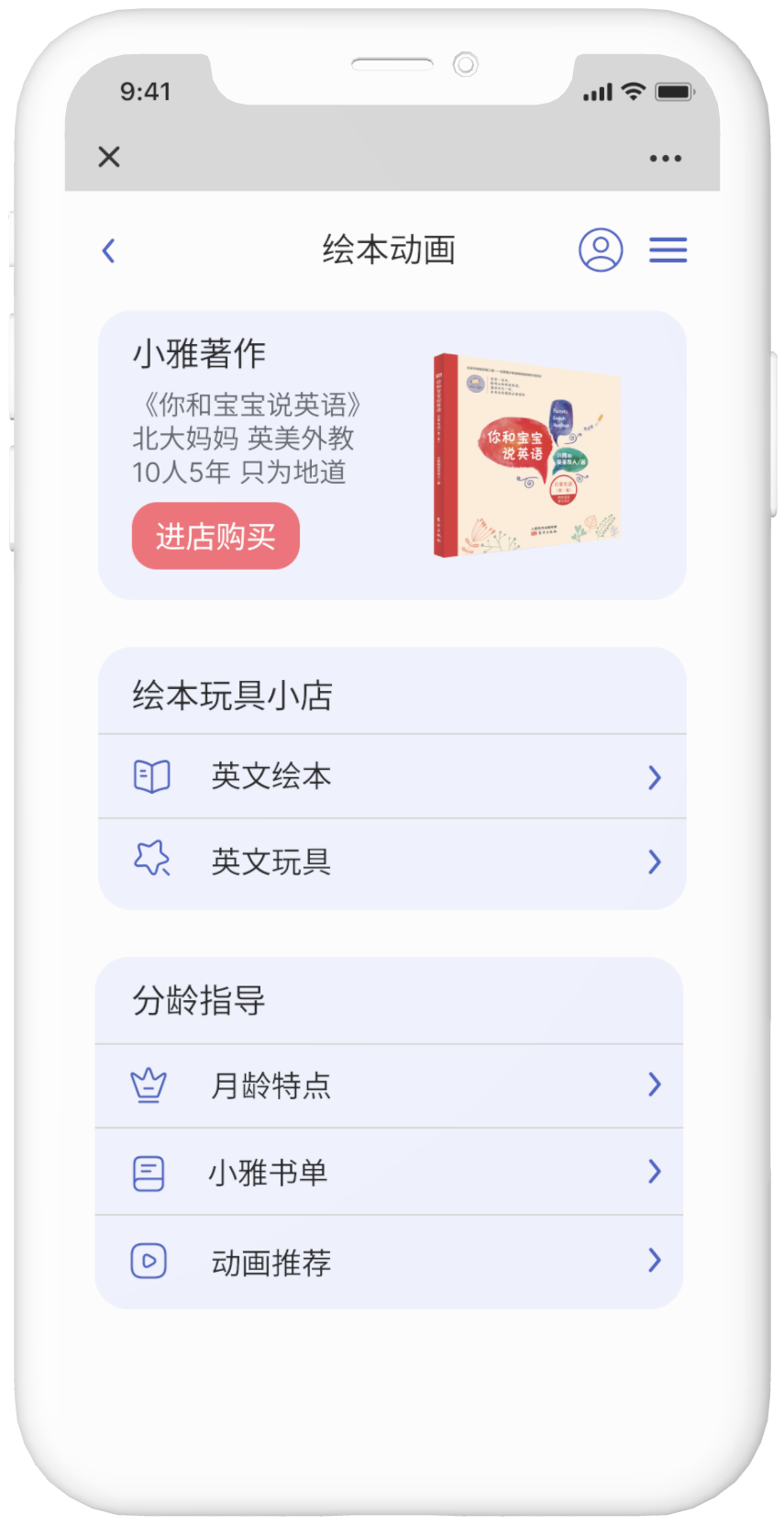
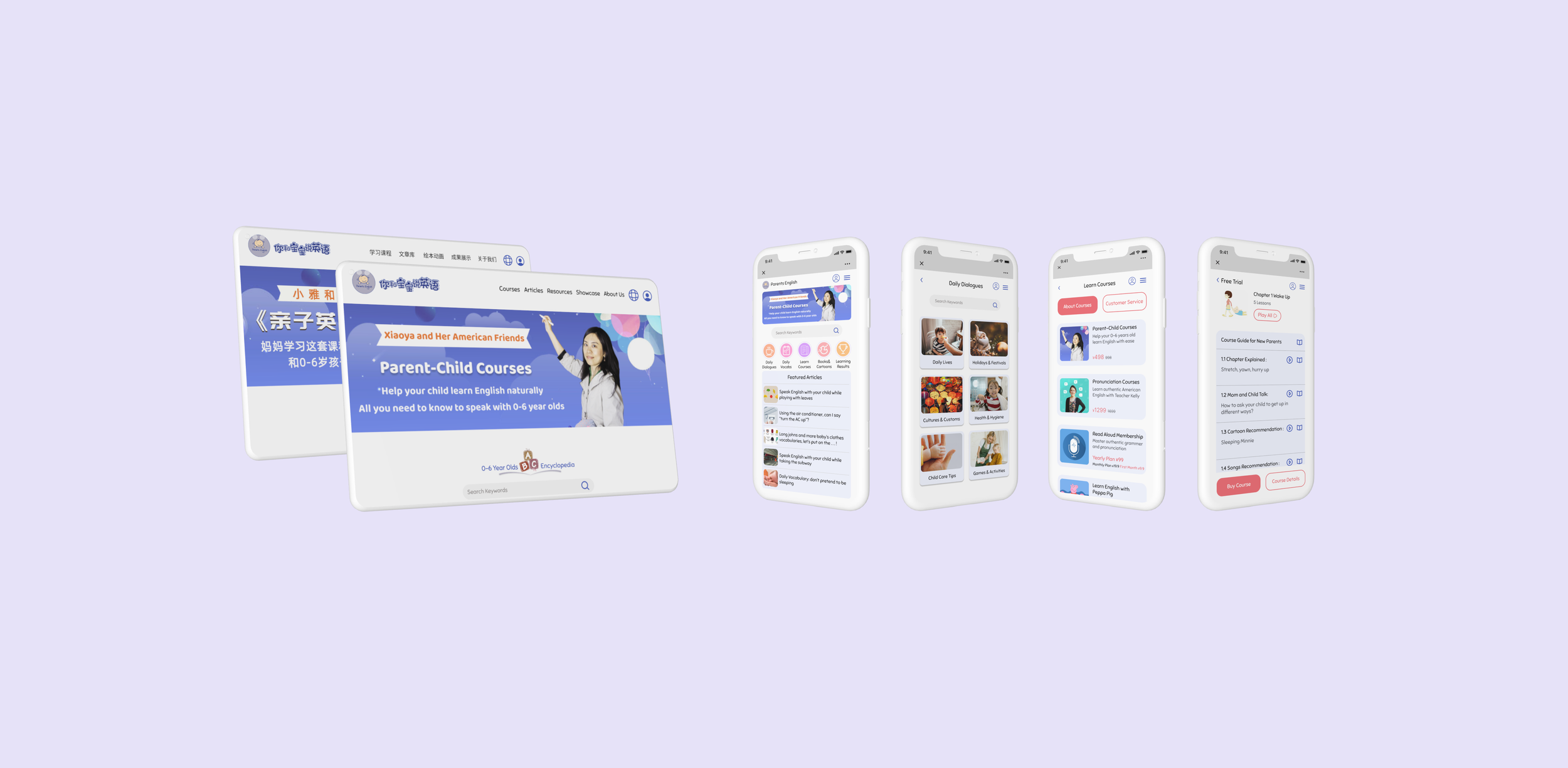
I created the high-fidelity wireframes for the mobile and desktop homepage. Since this is a mobile-first project, I created four main navigation pages, personal account page, and the navigation menu page for mobile. Upon my clients request to improve the user experience for taking courses, I also created pages for the user flow of exploring courses for mobile. Since the website support both English and Chinese, the high-fidelity wireframes were created in both languages.
Desktop Homepage in English and Chinese Mode
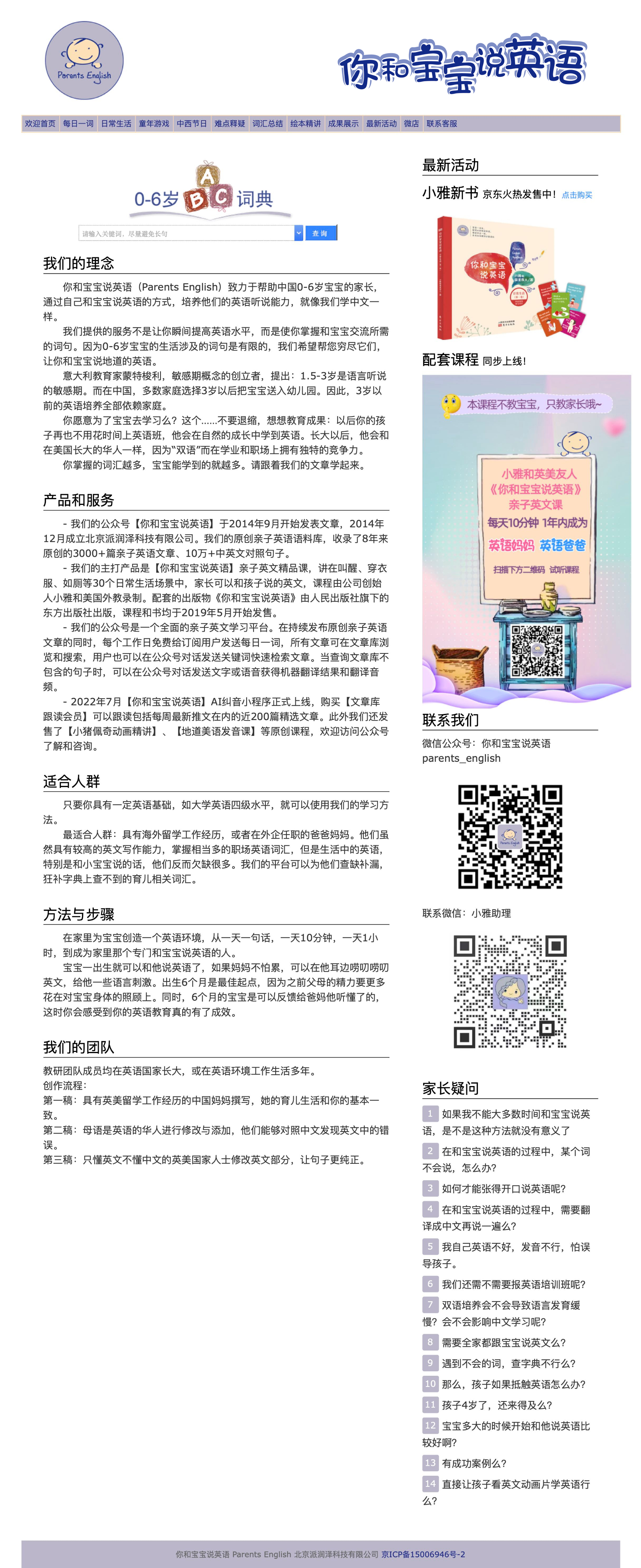
Before Redesign
After Redesign
Mobile Interface in English Mode
Mobile Interface in Chinese Mode
User Pain Points Addressed In Redesign
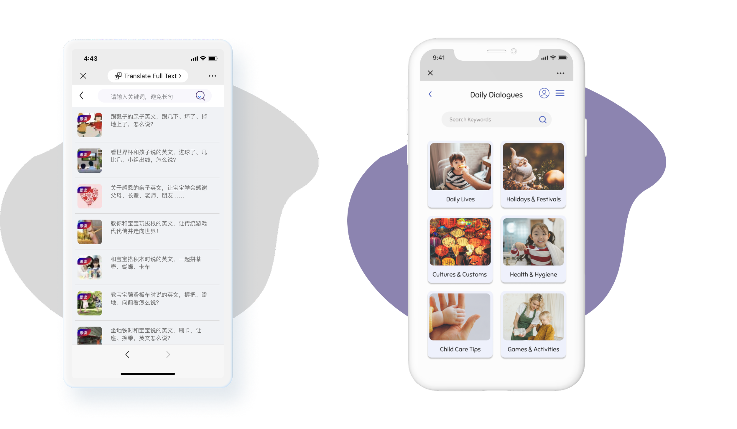
Better Categories of Articles
Before
After
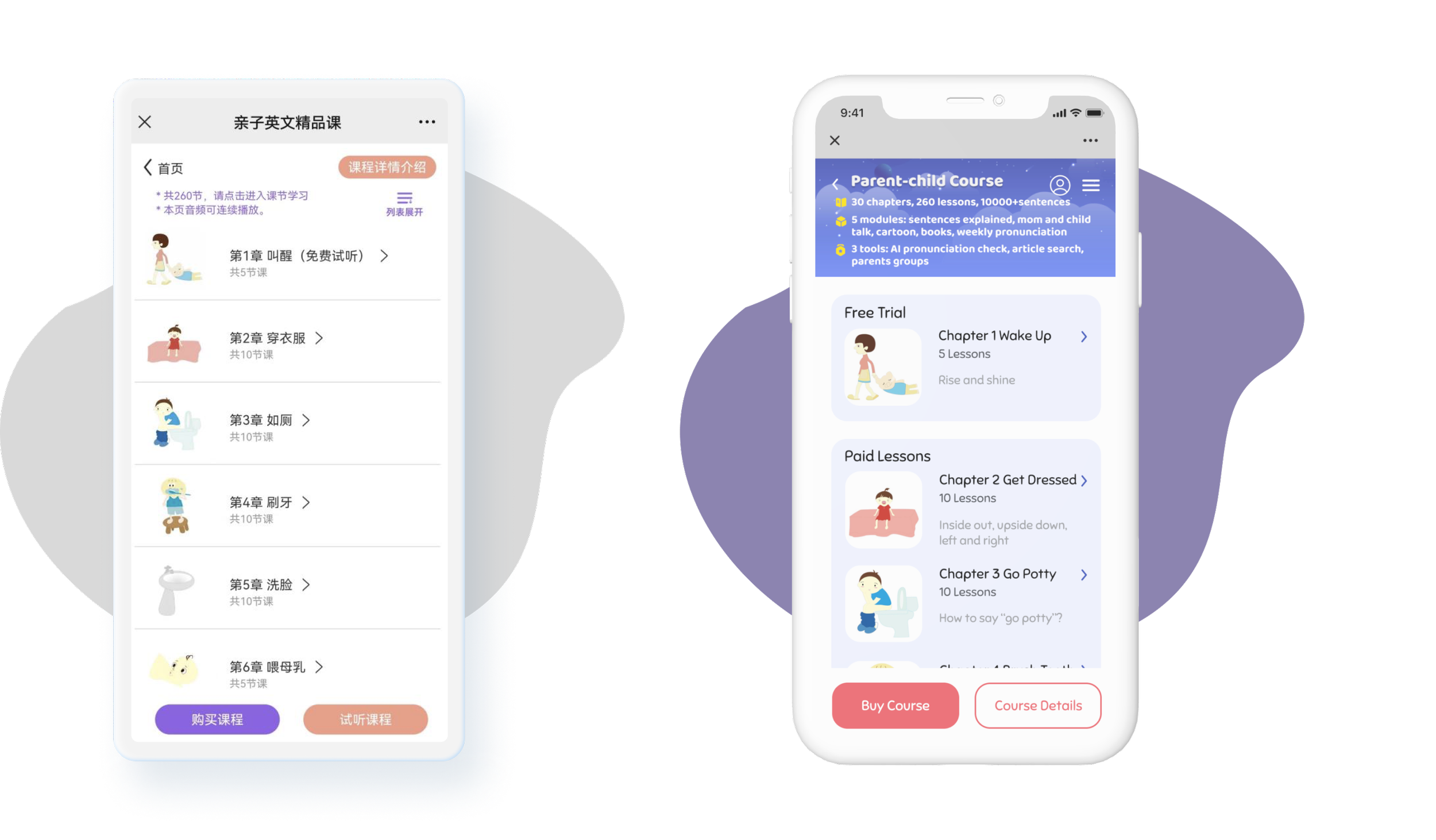
Easier Access to Lessons
Before
After
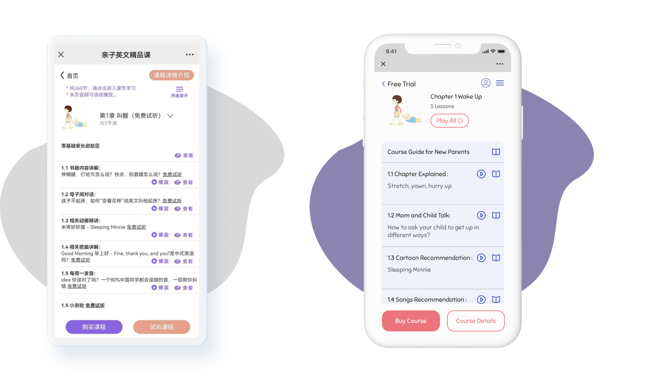
Auto-play Between Different Lessons
Before
After
Test
Usability Testing
I created an unmoderated usability test with Maze and tested with 9 participants for this project. 4 users did the test with their phone, 5 users did it with their laptop. Users were asked to do the following 5 tasks with the mobile prototype:
Explore Daily Dialogues
Explore Courses
Explore Books & Cartoons
Check My Account
Take A Free Trial from Parent-Child Course Chapter 1 Lesson 1.1
Among the 5 tasks, task 2 to 4 have higher success rate compared to task 1 and 5. Feedback from users indicates that when they just started the test some of them need some time to understand the task and layout of the interface, which resulted in misclicks in the task 1. Once users fully understand the tasks they find the following tasks relatives easy to complete. Task 5 has a lower success rate due to the task require more steps and there are different paths users can take to complete the task.
Priority Iterations
The usability test result helped me identify some issues to iterate on to improve user experience. After discussed with my client, we decided to move forward with the following iterations:
Iteration 1
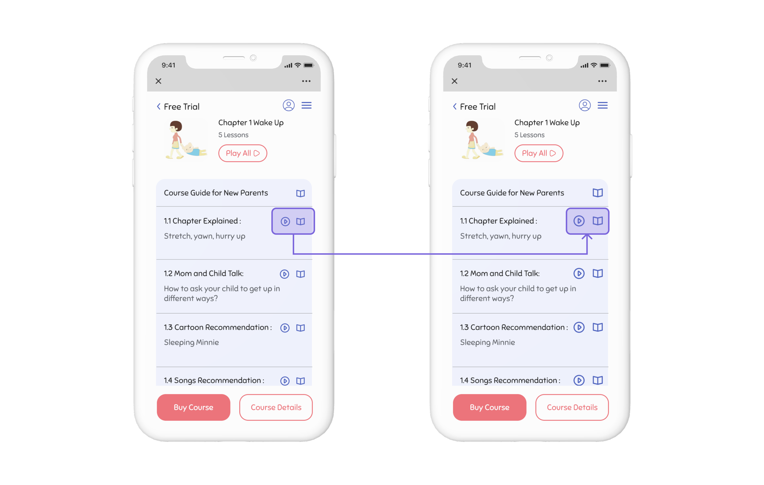
According to feedback from the usability test, the size of the touch point could possibly lead to mis-click which might be the reason of the low success rate of task 5. Therefore, I made an iteration to increase the size of the “Play Audio” and “Go to Lesson” icon to make the touch target more clickable.
Version 1
Version 2
Iteration 2
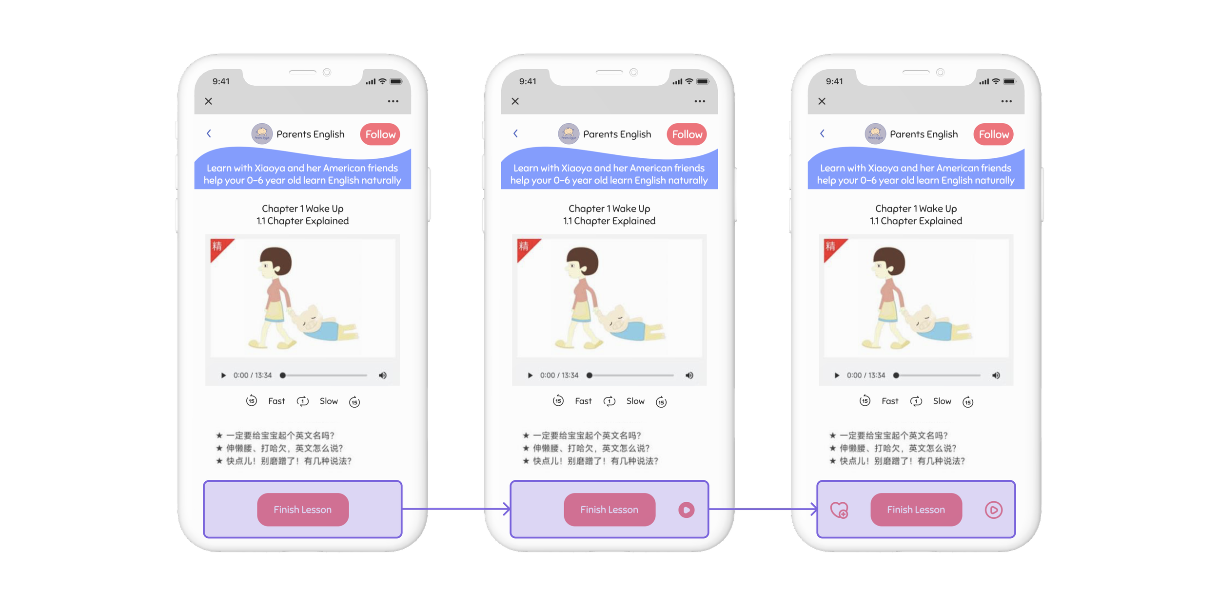
Feedback from users shows that it would be useful to add an “Play Audio“ button at the bottom bar on the lesson detail page so that users can control the audio without scrolling all the way back to the top. So I added a “Play Audio” button in version 2. After meeting with my client, we decided to add a “Bookmark Lesson” Icon in version 3 so that users can save lessons. Also the design of the “Play Audio” icon was changed from solid to linear to match with the bookmark icon.
Version 1
Version 2
Version 3
My Takeaways
Learn to compromise
Working with parents in English taught me the importance of compromise as a designer. Balancing design principles and the client's preferences, I aimed for a functional and appealing design that satisfied both parties.
Research comes first
Prioritizing user research, I persuaded the client to adopt my design based on findings during the ideation stage. Defending my design with data proved valuable in this experience.
Next steps
This case study focused on main pages and the task flow for mobile course enrollment. Future steps involve creating additional task flows and pages for a comprehensive mobile user experience, incorporating feedback from stakeholders and developers.

